")

Your WordPress site doesn’t have to look like a budget DIY project. Small business owners, bloggers, and entrepreneurs can create an expensive looking website that rivals professionally designed sites without hiring a designer or breaking the bank.
This guide is for anyone who wants to make WordPress look professional but needs to keep costs low. You’ll learn practical WordPress design tips that transform basic sites into polished, high-end experiences that build trust with visitors and convert better.
We’ll cover how to select premium WordPress themes that instantly elevate your brand presence, master WordPress typography and color schemes that create visual hierarchy, and optimize images for maximum impact. You’ll also discover WordPress layout principles and navigation design strategies that give your site that expensive, custom-built feel.
By the end, you’ll have a professional WordPress site that looks like you invested thousands in custom design work.
Choose a Premium-Quality Theme That Commands Attention

Select themes with clean, modern layouts and professional typography
Your theme choice makes or breaks your site’s professional appearance. Premium-quality themes feature carefully crafted layouts with generous spacing, consistent alignment, and elegant typography that immediately signals quality. Focus on themes that showcase readable fonts, well-structured content hierarchies, and polished visual elements that create an expensive look without requiring design expertise.
Prioritize responsive designs that work flawlessly across all devices
A responsive design that adapts seamlessly across desktop, tablet, and mobile devices screams professionalism. Premium WordPress themes automatically adjust layouts, images, and navigation to provide optimal viewing experiences on any screen size. Test potential themes on multiple devices before committing – broken mobile layouts instantly destroy credibility and make your site appear amateurish.
Look for themes with customizable headers and advanced layout options
Flexibility separates premium themes from basic templates. Seek themes offering customizable header designs, multiple layout configurations, and advanced customization panels that let you adjust colors, fonts, and spacing without coding. These features allow you to create a unique brand presence while maintaining the theme’s professional foundation, giving you designer-level control over your site’s appearance.
Avoid overcrowded themes with too many design elements
Resist themes packed with flashy animations, busy backgrounds, and excessive design elements that scream “amateur hour.” Professional websites embrace simplicity and strategic use of visual elements. Choose themes with clean aesthetics, subtle animations, and focused design elements that enhance rather than distract from your content. Remember – expensive-looking sites often feature more white space than decorative elements.
Master Typography to Create Visual Hierarchy
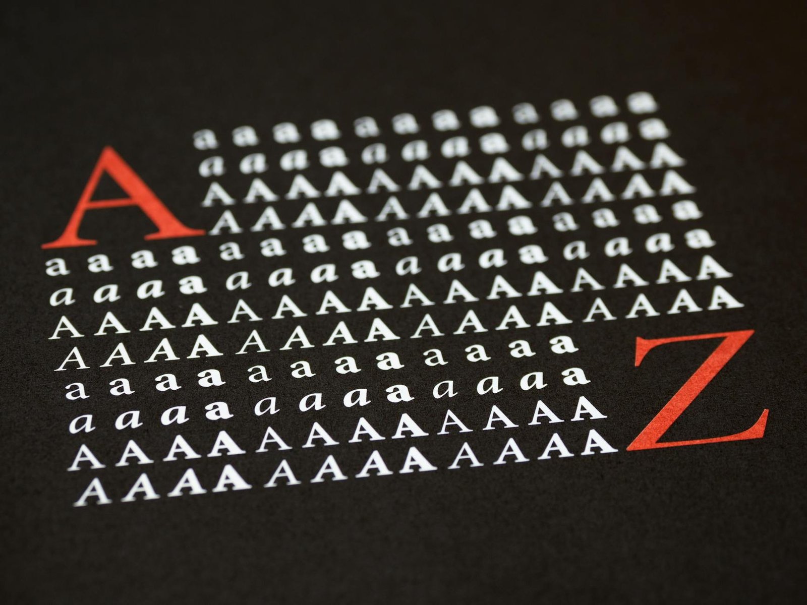
Replace default fonts with elegant Google Fonts combinations
Typography transforms your WordPress site from amateur to professional instantly. Default system fonts scream “budget website,” while carefully chosen Google Fonts create visual sophistication. Pair serif headings like Playfair Display with clean sans-serif body text such as Source Sans Pro. This contrast establishes immediate credibility and makes your content feel premium.
Establish consistent font sizes and spacing throughout your site
Professional WordPress typography demands mathematical precision in sizing and spacing. Use a modular scale where your body text starts at 16-18px, subheadings at 24px, and main headings at 36-48px. Line height should be 1.5-1.6 times your font size for optimal readability. Consistent spacing between elements creates rhythm and prevents your site from looking chaotic or unprofessional.
Use font weights strategically to guide reader attention
Font weights are your secret weapon for creating WordPress visual hierarchy without overwhelming your design. Reserve bold (700) weights for primary headings only, use medium (500-600) for subheadings, and stick to regular (400) for body text. Strategic weight variations guide your reader’s eye naturally through your content, making your site feel intentionally designed rather than thrown together.
Implement a Sophisticated Color Palette
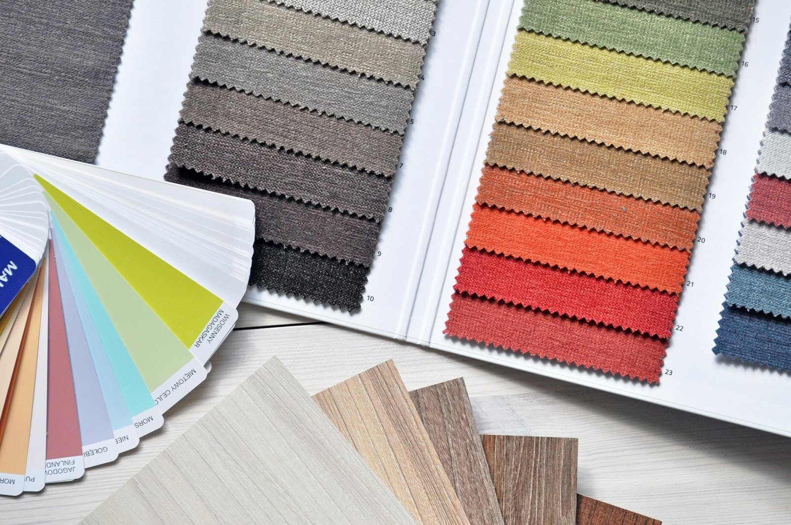
Choose a limited color scheme of 2-3 complementary colors
Creating a sophisticated WordPress color scheme starts with restraint. Professional websites typically use just 2-3 colors maximum – one primary color for branding, one neutral base color, and optionally one accent color for highlights. This limited palette prevents your site from looking chaotic or amateur. Tools like Adobe Color or Coolors can help you find complementary colors that work harmoniously together, ensuring your WordPress design tips create a cohesive, expensive-looking website.
Use neutral backgrounds with strategic accent colors
Neutral backgrounds provide the perfect foundation for a premium WordPress design. Stick to whites, light grays, or subtle off-whites as your base, then introduce your brand colors strategically in buttons, links, and call-to-action elements. This approach mirrors high-end website design where bold colors are used sparingly for maximum impact. Your WordPress color scheme should guide visitors’ eyes to important elements without overwhelming them with visual noise.
Ensure sufficient contrast for optimal readability
Poor contrast screams amateur design faster than anything else. Your text must be easily readable against your chosen backgrounds – aim for a contrast ratio of at least 4.5:1 for normal text and 3:1 for large text. Dark gray text (#333333) on white backgrounds works better than pure black, while maintaining excellent readability. Test your color combinations on different devices and screen brightness levels to ensure your professional WordPress site remains accessible to all users.
Apply colors consistently across all site elements
Consistency transforms a good color palette into a professional WordPress design. Every button, link, heading, and accent element should follow your established color rules. Create a simple style guide documenting your exact color codes and their specific uses – primary buttons use your main brand color, secondary buttons use neutral tones, error messages use red, success messages use green. This systematic approach to your WordPress layout principles ensures visitors perceive your site as polished and professionally designed.
Optimize Your Images for Maximum Visual Impact
Use high-resolution, professional-quality stock photos
Professional images transform your WordPress site instantly. Skip pixelated photos and blurry graphics that scream amateur. Invest in high-resolution stock photos from platforms like Unsplash, Pexels, or premium services like Shutterstock. Choose images with crisp details, proper lighting, and compositions that align with your brand message. Professional photography creates immediate credibility and elevates your site’s perceived value without requiring a photographer.
Maintain consistent image sizes and aspect ratios
Consistency creates the polished look that separates expensive sites from DIY disasters. Establish standard dimensions for different image types – perhaps 1200×800 pixels for blog headers and 600×400 for thumbnails. Stick to these measurements religiously. Mixed aspect ratios create visual chaos that instantly reveals amateur design. Use WordPress image editing tools or plugins like Smush to resize images automatically and maintain your established ratios across every page.
Apply subtle filters or overlays for brand consistency
Brand cohesion elevates perceived quality dramatically. Apply consistent filters, overlays, or color treatments to create visual unity across your WordPress image optimization strategy. A subtle blue overlay on all hero images or a warm filter on product photos creates professional consistency. Tools like Canva or built-in WordPress editors allow you to apply these treatments easily. Your images should feel like they belong to the same premium brand family.
Compress images properly to maintain fast loading speeds
Speed kills conversion rates and destroys user experience faster than any design flaw. Large, uncompressed images slow your site to a crawl, making visitors bounce before experiencing your premium design. Use compression tools like TinyPNG or WordPress plugins like Smush to reduce file sizes without sacrificing visual quality. Aim for images under 100KB when possible. Fast-loading professional images create the seamless experience that expensive websites deliver consistently.
Design Clean Navigation and User Interface Elements
Simplify your main menu with clear, descriptive labels
Your WordPress navigation design should feature a streamlined main menu with intuitive labels like “Services,” “About,” or “Contact” instead of creative but confusing terms. Keep menu items to 5-7 maximum, grouping related pages under dropdown menus when necessary. Clear navigation immediately signals professionalism and helps visitors find what they need without frustration.
Create prominent call-to-action buttons with contrasting colors
Strategic call-to-action buttons transform casual browsers into engaged users. Design buttons with bold, contrasting colors that stand out from your WordPress color scheme – think bright orange against a navy background or deep green on white. Use action-oriented text like “Get Started,” “Download Now,” or “Book Consultation” rather than generic “Click Here” labels.
Remove unnecessary widgets and sidebar clutter
Professional websites embrace minimalism by eliminating sidebar clutter that distracts from your main content. Remove generic widgets like tag clouds, recent comments, or calendar features that add no real value. Keep only essential elements like contact information, recent posts, or newsletter signup forms. Clean sidebars create visual breathing room and direct attention to your primary messaging.
Implement breadcrumbs for improved user experience
Breadcrumb navigation shows visitors their current location within your site structure, creating a more polished user experience. WordPress plugins like Yoast SEO automatically generate breadcrumbs that appear as “Home > Services > Web Design” paths. This simple addition reduces bounce rates, improves site navigation, and demonstrates attention to professional WordPress design details that separate amateur sites from expensive-looking ones.
Leverage White Space and Layout Principles
Increase padding and margins for a more spacious feel
Professional websites breathe. Add generous padding around text blocks, buttons, and content sections to create that expensive, uncluttered look. WordPress layout principles show that cramped elements scream amateur design. Double your default margins between sections and watch your site transform from cluttered to luxurious instantly.
Align elements consistently using grid-based layouts
Grid-based layouts create visual order that separates premium sites from DIY disasters. Use WordPress’s built-in column blocks or CSS Grid to align images, text, and buttons along invisible lines. Consistent alignment makes visitors unconsciously trust your brand more. Every element should connect to an imaginary framework – no random placement allowed.
Group related content together with adequate spacing
Smart spacing tells a story. Place related items closer together while separating different content sections with white space. Your blog posts, testimonials, and service descriptions need breathing room. WordPress design tips emphasize that proper grouping reduces cognitive load, making your expensive looking website feel effortless to navigate and professionally organized.
Add Professional Finishing Touches
Create a custom logo or wordmark for brand recognition
A professional logo instantly elevates your WordPress site’s credibility and creates memorable brand recognition. Use free tools like Canva, GIMP, or even Google Fonts to design a clean wordmark featuring your business name in an elegant typeface. Keep it simple—think Apple or Nike—and ensure it looks crisp at any size. Your logo should work perfectly as a favicon, header element, and social media profile image.
Design consistent social media icons and contact information
Visual consistency across all contact touchpoints makes your WordPress site look professionally designed and trustworthy. Choose a matching icon style—whether filled, outlined, or minimalist—and stick with it throughout your site. Position social media icons strategically in your header, footer, or sidebar using the same color scheme as your overall design. Create a dedicated contact section with properly formatted phone numbers, email addresses, and physical location details.
Implement subtle animations and hover effects
Strategic micro-interactions transform a static WordPress site into an engaging, expensive-looking experience that rivals custom designs. Add gentle hover effects to buttons, links, and images using CSS transitions—think slight color changes, soft shadows, or smooth scaling. Implement fade-in animations for content sections as users scroll, creating a dynamic browsing experience. Keep animations subtle and purposeful; overdoing effects can make your site look amateur rather than professional.
Add testimonials and trust badges to build credibility
Social proof elements instantly boost your WordPress site’s perceived value and professional appearance without requiring designer expertise. Display client testimonials in clean, well-formatted cards with photos, names, and company details. Add trust badges from recognized organizations, security certificates, or industry associations prominently on your homepage and contact pages. Include case study snippets, client logos, or review stars to demonstrate real business success and build visitor confidence.
Ensure all forms are styled consistently with your brand
Cohesive form styling across your entire WordPress site creates a polished, professional appearance that users associate with expensive custom design. Style input fields, buttons, and labels to match your color palette, typography choices, and overall visual hierarchy. Use consistent spacing, border radius, and hover states for all interactive elements. Apply the same styling to contact forms, newsletter signups, and checkout processes to maintain brand consistency throughout the user journey.

A high-end WordPress site doesn’t require a hefty designer budget – it just needs the right approach. By selecting a premium-quality theme, perfecting your typography, and implementing a sophisticated color scheme, you’re already halfway to that polished look. Clean navigation, optimized images, and strategic use of white space will elevate your site from amateur to professional in no time.
The secret lies in the details. Those professional finishing touches, combined with smart layout principles, create the kind of visual impact that makes visitors assume you spent thousands on custom design. Start with one or two of these strategies today, and gradually work through the rest. Your WordPress site can look just as expensive as those custom-built competitors – you just need to know which buttons to push.


