Typography can make or break your blog’s success. Poor font choices drive readers away within seconds, while smart blog typography keeps them engaged and coming back for more.
This guide is for bloggers, content creators, and website owners who want to transform their design without hiring a professional. You’ll discover which best fonts for blogs actually work and learn proven font pairing strategies that boost readability and credibility.
We’ll cover essential typography fundamentals that instantly improve how readers experience your content. You’ll also get access to tested blog font combinations that work across different niches, plus practical implementation tips that prevent common design mistakes. By the end, you’ll have everything needed to create professional-looking typography design that makes your blog stand out.
Typography Fundamentals That Transform Blog Readability
Understanding the psychology of font choices on reader engagement
Typography directly impacts how readers perceive and interact with your content. Serif fonts like Times New Roman create trust and authority, making them perfect for professional blogs, while sans-serif fonts like Helvetica feel modern and approachable for lifestyle content. Script fonts trigger emotional responses but can overwhelm readers if overused. Your font choices subconsciously communicate your brand personality—clean, minimalist fonts suggest efficiency and innovation, while decorative fonts imply creativity and playfulness.
Key typography principles every blogger must master
Contrast serves as the foundation of effective blog typography, ensuring text stands out against backgrounds for optimal readability. Line spacing between 1.4-1.6 prevents cramped text that strains eyes during long reading sessions. Font size should never drop below 16px for body text, as smaller sizes force readers to squint and abandon your content. Consistency across headings, subheadings, and body text creates professional polish that keeps readers engaged throughout your entire post.
How font hierarchy creates visual flow and guides attention
Strategic font hierarchy transforms walls of text into scannable, digestible content that readers actually finish. Your main heading should be 2-3 times larger than body text, immediately establishing importance and drawing attention. Subheadings act as stepping stones, guiding readers through your content while providing natural break points for better comprehension. Weight variations—bold for emphasis, regular for body text—create visual landmarks that help readers navigate complex information effortlessly, increasing time spent on your blog.
Essential Font Categories and Their Strategic Applications
Serif fonts for establishing authority and trust
Serif fonts like Times New Roman, Georgia, and Merriweather bring gravitas to your blog typography. Their traditional letterforms with small decorative strokes create a sense of reliability that readers associate with newspapers, academic publications, and established brands. These web typography choices work exceptionally well for finance, law, education, and lifestyle blogs where credibility matters most.
Sans-serif fonts for modern clarity and clean aesthetics
Sans-serif fonts strip away decorative elements to deliver crystal-clear readability across all devices. Popular choices like Open Sans, Lato, and Montserrat create sleek, contemporary designs that tech blogs, startups, and minimalist brands love. These blog design fonts load faster, scale beautifully on mobile screens, and maintain their crisp appearance at any size, making them perfect for modern digital experiences.
Display fonts for impactful headers and brand personality
Display fonts transform ordinary headlines into powerful brand statements. Bold, decorative typefaces like Playfair Display, Oswald, and Bebas Neue grab attention instantly while conveying your blog’s unique personality. Smart bloggers use these typography design elements sparingly—reserving them for main headings and key sections where maximum impact drives engagement and reinforces brand recognition.
Script fonts for adding elegance and personal touch
Script fonts bring warmth and personality to blog typography through their handwritten appearance. Elegant options like Dancing Script, Pacifico, and Great Vibes work beautifully for lifestyle, wedding, food, and creative blogs. These font pairings shine when used for quotes, signatures, or accent text, but should never overwhelm your main content where readability fonts take priority.
Proven Font Pairing Formulas That Never Fail
The Classic Contrast Method: Pairing Serif with Sans-Serif
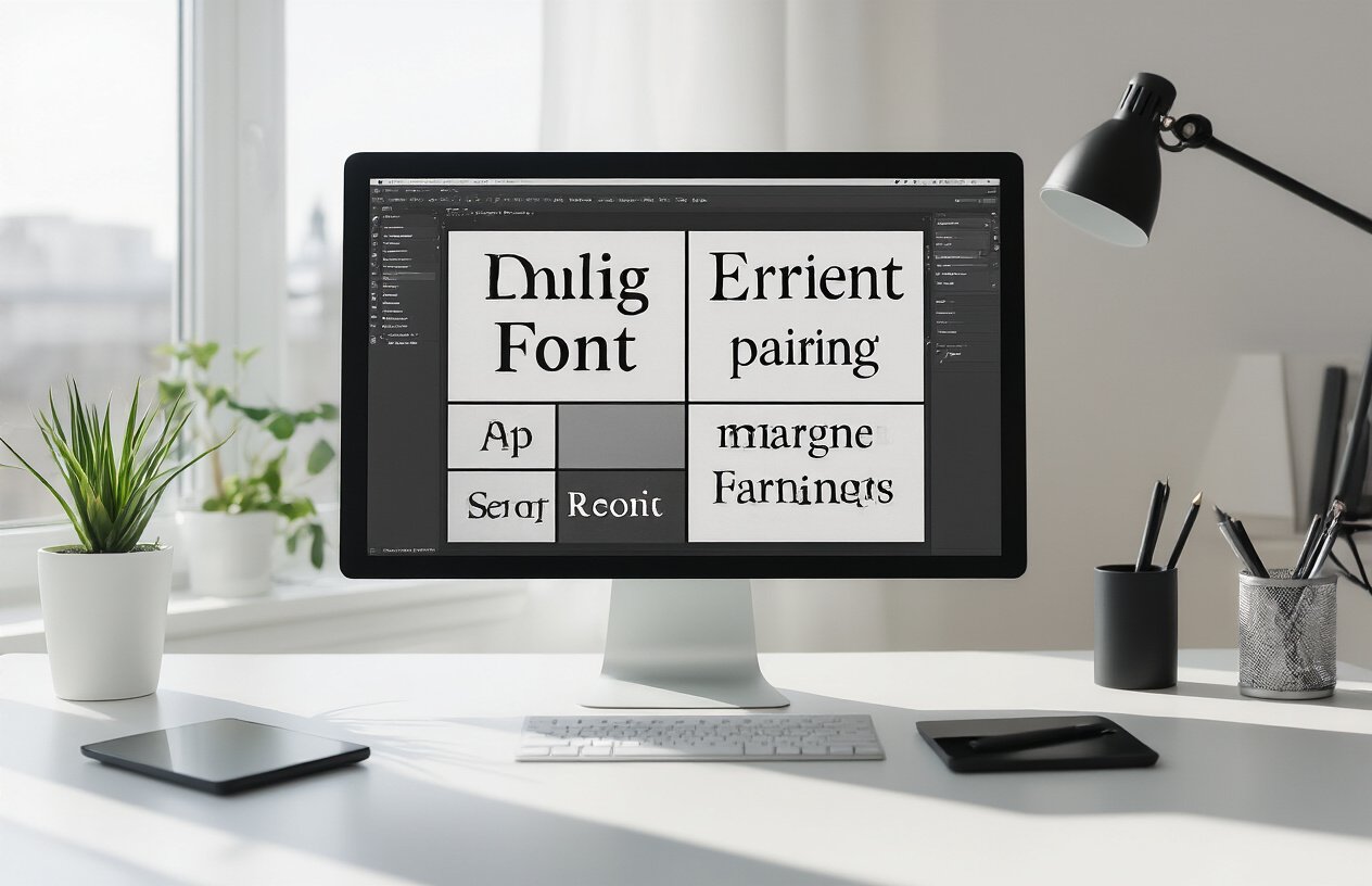
Combining serif and sans-serif fonts creates instant visual hierarchy and professional appeal in blog typography. This timeless approach works because serif fonts (like Georgia or Times) bring traditional elegance to headers while clean sans-serif fonts (like Open Sans or Lato) deliver maximum readability for body text. The contrast between decorative serifs and streamlined sans-serif creates natural reading flow that guides readers effortlessly through your content.
Creating Harmony with Fonts from the Same Family
Font families offer built-in compatibility that eliminates guesswork in blog font combinations. When you choose different weights and styles from families like Roboto, Montserrat, or Source Sans Pro, you maintain visual consistency while creating clear content hierarchy. This approach guarantees harmonious typography design since family fonts share identical letter structures, spacing, and character proportions, making your blog feel cohesive and professionally designed.
Balancing Decorative Headers with Readable Body Text
Decorative headers demand careful pairing with highly readable body fonts to maintain blog functionality. Bold display fonts like Playfair Display or Oswald work brilliantly for attention-grabbing headlines when paired with neutral body fonts such as Lora or Nunito Sans. The key lies in ensuring decorative elements enhance rather than compete with your content – striking headers draw readers in while readable typography keeps them engaged throughout your posts.
Weight and Style Variations Within Single Font Families
Single font families provide endless pairing possibilities through weight and style combinations that create sophisticated blog typography. Using light weights for body text, medium weights for subheadings, and bold weights for main headers within families like Inter or Poppins creates clear visual hierarchy. This typography best practices approach ensures consistency while offering enough contrast to guide readers naturally through your content structure and improve overall readability fonts performance.
Top High-Impact Font Combinations for Different Blog Niches
Professional business blogs: combinations that build credibility
Playfair Display paired with Source Sans Pro creates an authoritative yet approachable look that builds instant trust. The elegant serif headlines command attention while the clean sans-serif body text ensures easy reading across devices. Alternatively, Merriweather and Open Sans deliver professional credibility with exceptional readability. These blog font combinations work perfectly for consulting firms, financial advisors, and corporate thought leaders who need typography that speaks competence and reliability.
Creative and lifestyle blogs: pairings that inspire and engage
Oswald and Lora create dynamic visual contrast that captures attention while maintaining readability for longer posts. The bold, condensed headlines paired with the warm, readable serif body text works beautifully for fashion, travel, and lifestyle content. Montserrat and Crimson Text offer another winning combination, blending modern geometric headlines with classic serif elegance. These font pairings for blogs help creative bloggers establish distinctive brand personalities that resonate with their artistic audiences.
Technical and educational content: fonts that enhance comprehension
Roboto Slab and Roboto create perfect harmony for technical blogs, with the slab serif headlines providing structure while the sans-serif body maintains clarity for complex information. IBM Plex Sans and IBM Plex Serif offer another excellent pairing specifically designed for technical communication. These web typography choices reduce cognitive load, making difficult concepts more accessible. The consistent x-heights and letter spacing in these blog typography combinations help readers process technical information more efficiently.
Typography Implementation Best Practices for Maximum Impact
Optimal font sizes and line spacing for web readability
Set your body text between 16-18px for optimal reading comfort, with headings scaling proportionally from 24px to 48px. Line spacing should be 1.4-1.6 times your font size – this creates breathing room that prevents text from feeling cramped. Paragraph spacing of 1.5em between blocks helps readers navigate your content effortlessly.
Color contrast principles that improve accessibility
Maintain a contrast ratio of at least 4.5:1 between text and background colors to meet accessibility standards. Dark gray (#333) on white backgrounds works better than pure black, reducing eye strain during extended reading sessions. Test your color combinations using accessibility tools to ensure all readers can comfortably engage with your blog typography.
Responsive typography that works across all devices
Design your typography to scale smoothly from mobile to desktop using relative units like em or rem instead of fixed pixels. Mobile screens need slightly larger font sizes (18-20px) due to reading distance differences. Set up fluid typography that adjusts automatically, ensuring your font pairings remain visually balanced across smartphones, tablets, and desktop computers.
Loading speed optimization for custom fonts
Limit yourself to 2-3 font weights maximum and preload critical fonts using rel="preload" in your HTML head. Choose variable fonts when possible – they contain multiple weights in a single file, dramatically reducing load times. Implement font-display: swap in your CSS to show fallback fonts immediately while custom fonts load in the background, preventing invisible text issues.
Common Typography Mistakes That Destroy Blog Design
Overusing decorative fonts and creating visual chaos
Decorative fonts are tempting, but they’re the fastest way to tank your blog’s readability. Stick to one accent font maximum – your readers’ eyes will thank you. When every heading screams for attention with fancy scripts and bold display typefaces, nothing actually stands out. Professional blog typography means restraint. Use decorative fonts sparingly for logos or single-word emphasis, never for body text or multiple headings.
Poor font size hierarchy that confuses readers
Your font size hierarchy guides readers through your content like a roadmap. When your H2s are smaller than your body text or your H3s tower over your main headings, readers get lost fast. Establish clear size relationships: H1s should dominate, H2s step down logically, and body text remains comfortable at 16-18px. Consistent spacing between different text levels creates the visual breathing room that keeps people reading instead of bouncing.
Neglecting mobile typography optimization
Mobile traffic dominates most blogs, yet many writers ignore how their font pairings perform on small screens. That elegant serif combination might look stunning on desktop but turns into a squinting nightmare on phones. Test your typography choices across devices religiously. Line height becomes critical on mobile – cramped text kills engagement instantly. Consider larger font sizes and simpler font combinations for mobile users who are often reading in suboptimal lighting conditions.
Choosing the right typography can make or break your blog’s visual appeal and reader experience. The font combinations and strategies we’ve covered will help you create a polished, professional look that keeps visitors engaged and coming back for more. Remember that great typography isn’t just about picking pretty fonts – it’s about creating hierarchy, improving readability, and reflecting your brand’s personality through thoughtful design choices.
Start implementing these proven font pairings and best practices on your blog today. Test different combinations with your content, pay attention to how your readers respond, and don’t be afraid to make adjustments as you go. Your typography should work as hard as your content to create an exceptional user experience that sets your blog apart from the competition.
