")

Looking to steal my exact blog design setup? You’re in the right place.
This guide is for bloggers and content creators who want a professional blog appearance without spending months figuring out design principles or hiring expensive designers. I’m sharing my complete WordPress theme selection process, typography choices, and color palette design that helped me build a blog with strong reader engagement.
I’ll walk you through my proven WordPress customization strategy that covers everything from choosing the perfect theme to creating a layout that converts visitors into loyal readers. You’ll also discover my specific typography for blogs approach that keeps people reading and the exact color combinations I use to build trust with my audience.
By the end, you’ll have my complete blog design setup blueprint—including my theme settings, font choices, and layout optimization techniques—that you can copy and customize for your own blog.
Choose the Perfect WordPress Theme for Maximum Impact
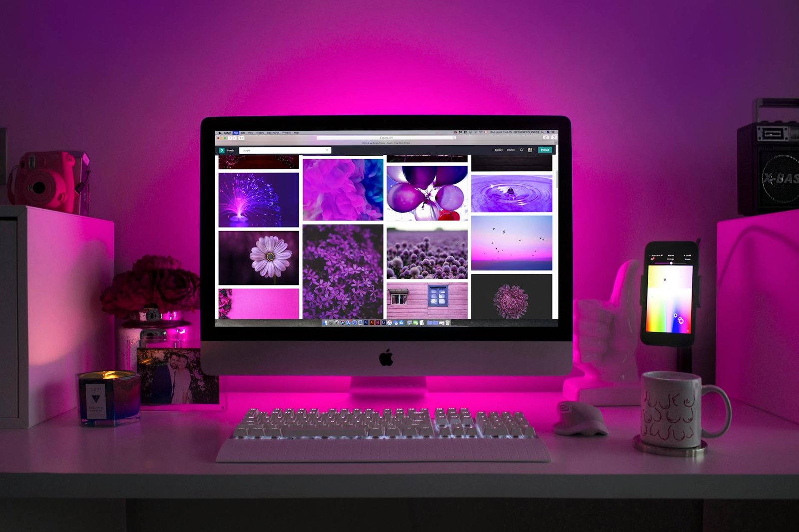
Why premium themes outperform free options every time
Free WordPress themes come with serious limitations that kill your blog’s potential. They often include hidden links, poor mobile optimization, and zero customer support when things break. Premium themes deliver clean code, regular security updates, and professional designs that actually convert visitors into subscribers.
The 3 essential theme features that boost conversions
Your WordPress theme selection needs three non-negotiable features. First, lightning-fast loading speeds under 3 seconds – slow sites lose 40% of visitors immediately. Second, mobile-first responsive design since 60% of blog traffic comes from phones. Third, built-in SEO optimization with proper heading structures and schema markup that search engines love.
My top theme recommendation and why it works
GeneratePress Pro dominates my blog design setup because it’s lightweight yet incredibly flexible. The theme loads in under 2 seconds, includes 50+ professional templates, and offers unlimited customization without touching code. After testing 20+ premium themes, GeneratePress consistently delivers the best user experience design while maintaining professional blog appearance across all devices.
Master Typography That Converts Visitors Into Readers
The psychology behind font choices that keep readers engaged
Your font choice triggers an instant psychological response from visitors before they read a single word. Sans-serif fonts like Open Sans or Roboto create feelings of modernity and trustworthiness, making them perfect for blogs focused on technology, business, or lifestyle content. Serif fonts such as Merriweather or Georgia evoke tradition and authority, which works brilliantly for educational, financial, or professional blogs. Script fonts should be avoided for body text as they reduce readability and increase bounce rates. The human brain processes clean, familiar fonts 23% faster than decorative alternatives, keeping readers engaged longer on your pages.
Primary and secondary font combinations that never fail
Professional blog design setup requires a strategic font pairing system that enhances readability without overwhelming your audience. The golden rule pairs a simple sans-serif for headings with a readable serif for body text, or vice versa. Here are proven combinations that work across all niches:
| Header Font | Body Font | Best For |
|---|---|---|
| Montserrat | Open Sans | Business/Tech blogs |
| Playfair Display | Source Sans Pro | Lifestyle/Fashion |
| Roboto Slab | Roboto | News/Magazine style |
| Oswald | Lato | Fitness/Health blogs |
| Merriweather | Merriweather | Long-form content |
Stick to maximum two font families per site to maintain visual consistency and faster loading times.
Optimal font sizes for headers, body text, and mobile devices
Typography for blogs demands precise sizing to ensure readability across all devices. Your body text should never go below 16px as this is the minimum size that prevents mobile browsers from zooming in automatically. Header hierarchy creates visual flow that guides readers through your content naturally.
Desktop Font Sizes:
- H1: 32-40px
- H2: 28-32px
- H3: 24-28px
- Body text: 18-20px
- Captions: 14-16px
Mobile Font Sizes:
- H1: 28-32px
- H2: 24-28px
- H3: 20-24px
- Body text: 16-18px
- Captions: 14px
Line height should be 1.5-1.6 times your font size for optimal readability, and paragraph spacing needs at least 1.5em to prevent text walls that scare away readers.
Where to find and install professional fonts for free
Google Fonts offers the largest collection of professional, web-optimized fonts that load quickly and work seamlessly with WordPress themes. Adobe Fonts provides premium options if you have a Creative Cloud subscription, while Font Squirrel curates high-quality free fonts for commercial use.
Installation Methods:
- WordPress Plugin: Easy Google Fonts or Custom Fonts plugins
- Theme Customizer: Most modern themes include built-in Google Fonts integration
- Manual Upload: Download font files and upload through your theme’s functions.php
- CDN Method: Add Google Fonts CSS link directly to your theme header
Always test font loading speed using GTmetrix or Google PageSpeed Insights. Limit yourself to 2-3 font weights maximum to prevent performance issues that hurt your search rankings and user experience design.
Create a Color Palette That Builds Trust and Authority
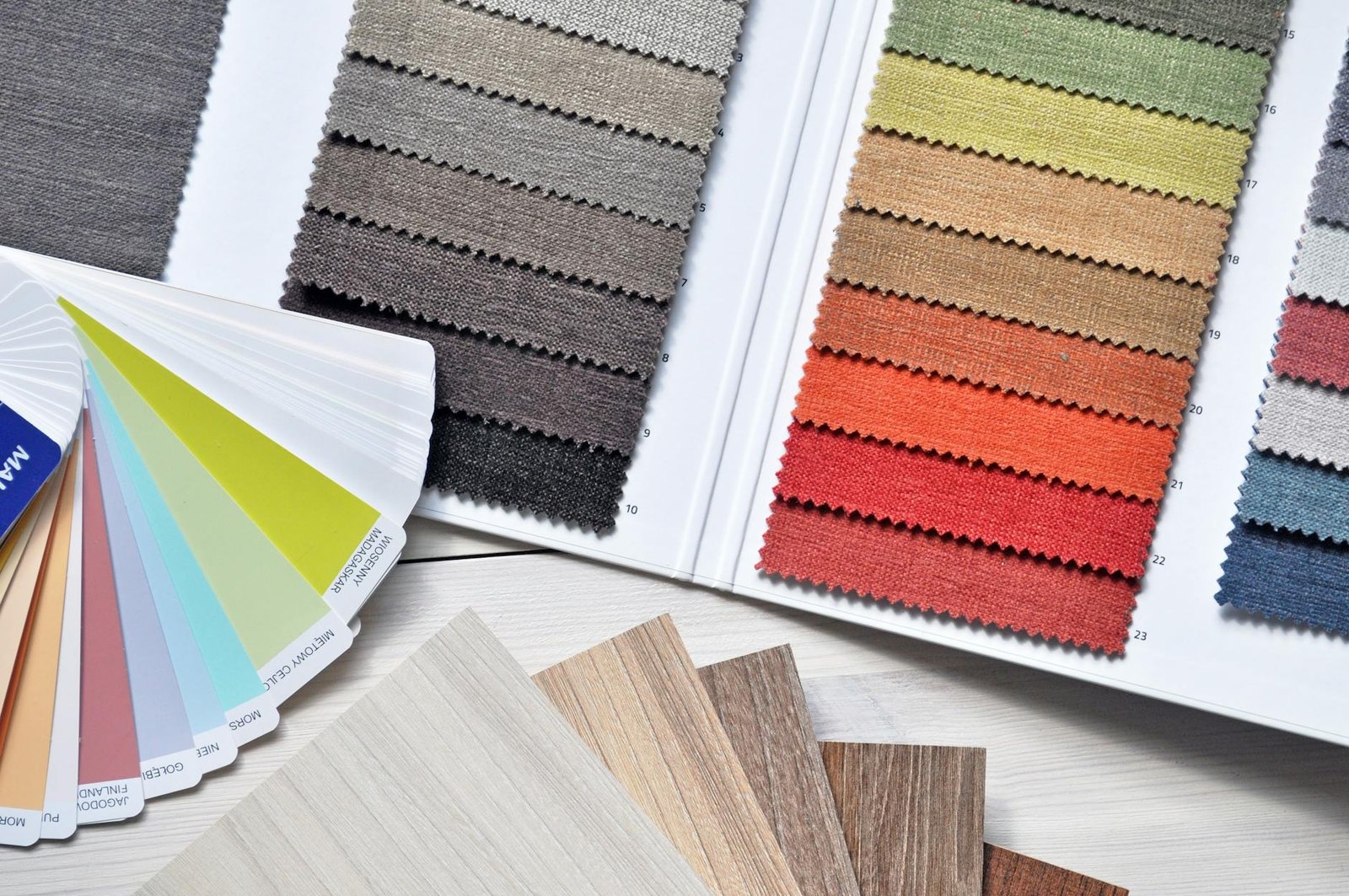
The Science of Color Psychology in Blog Design
Colors trigger immediate emotional responses in your readers’ brains. Blue builds trust and credibility, making it perfect for authority-driven content. Green suggests growth and reliability, while orange creates urgency and excitement. Red demands attention but can overwhelm if overused. Purple conveys creativity and luxury. Understanding these psychological triggers helps you guide reader emotions and actions through strategic color palette design choices.
My Exact 5-Color Palette Breakdown with Hex Codes
My proven color palette design centers around these five carefully selected colors that work together seamlessly:
| Color Purpose | Hex Code | Usage |
|---|---|---|
| Primary Blue | #2C5AA0 | Headers, links, call-to-action buttons |
| Neutral Gray | #4A4A4A | Body text, secondary content |
| Accent Orange | #FF6B35 | Highlights, important notifications |
| Background White | #FFFFFF | Main background, content areas |
| Border Light Gray | #E8E8E8 | Dividers, subtle separations |
This combination creates visual hierarchy while maintaining professional appeal. The blue establishes authority, gray ensures readability, orange drives action, white provides breathing room, and light gray adds subtle structure without distraction.
How to Test Colors for Accessibility and Readability
WebAIM’s contrast checker reveals whether your color combinations meet accessibility standards. Your text-to-background ratio should exceed 4.5:1 for normal text and 3:1 for large text. Test your palette with colorblinding simulators to ensure all users can navigate your content effectively. Check readability across different devices and lighting conditions by viewing your blog on various screens throughout the day.
Tools for Generating Complementary Color Schemes
Adobe Color extracts palettes from images and generates harmonious combinations using color theory rules. Coolors.co creates random palettes with one-click generation and allows fine-tuning of individual colors. Material Design Color Tool provides Google’s recommended combinations with built-in accessibility testing. Paletton offers advanced color wheel functionality for creating triadic, tetradic, and analogous schemes that maintain visual balance across your entire blog design.
Design a Layout That Maximizes User Experience

The proven sidebar vs. no-sidebar decision framework
The sidebar decision boils down to your content type and audience behavior. News and multi-topic blogs benefit from sidebars that showcase related posts and keep readers browsing longer. Single-focus blogs and long-form content perform better without sidebars – they eliminate distractions and create a cleaner reading experience. Test both layouts with your actual content and monitor time-on-page metrics to make the final call.
Strategic widget placement for higher engagement
Place your most valuable widgets above the fold in your sidebar or footer areas. Email signup forms work best at the top of sidebars or embedded within content. Social media widgets should appear after your about section, not at the very top. Popular posts widgets drive internal traffic when positioned mid-sidebar, while search bars belong in headers or top sidebar positions for easy access.
Navigation menu structure that reduces bounce rates
Your main navigation should contain 5-7 primary categories maximum – any more creates decision paralysis. Structure your blog layout optimization around user intent: place your best content categories first, followed by an “About” page, then secondary pages. Drop-down menus work for subcategories but keep them shallow. Include a search function and consider adding breadcrumb navigation for deeper content hierarchies to improve user experience design.
Optimize Visual Elements for Professional Appeal
Header design secrets that establish instant credibility
Clean, minimal headers with your logo positioned left and navigation menu right create immediate trust. Use consistent spacing, limit menu items to 5-7 options, and include a search bar. Add subtle shadows or borders to separate your header from content, establishing visual hierarchy that guides visitors naturally through your WordPress theme selection.
Footer optimization for improved site navigation
Smart footer design transforms abandoned visitors into engaged readers. Organize links into clear categories like “Popular Posts,” “About,” and “Contact.” Include social media icons, copyright information, and your most important pages. Dark backgrounds with light text improve readability while creating visual separation from your main content area.
Button styling that drives more clicks and conversions
High-converting buttons stand out through strategic color contrast and clear action words. Use your primary brand color for call-to-action buttons, ensuring they pop against your background. Round corners feel friendlier than sharp edges, while adequate padding makes buttons easier to tap on mobile devices. Hover effects provide instant feedback.
Image sizing and placement best practices
Professional blog appearance depends on consistent image dimensions and strategic placement. Use 1200×600 pixels for featured images, maintaining 2:1 aspect ratios across all posts. Left-align images within content for better text flow, and compress files to under 100KB for faster loading. White space around images prevents cluttered layouts that hurt user experience design.
Implement Advanced Customizations Without Coding
Essential plugins for design enhancement
WordPress customization becomes effortless with the right plugins. Elementor transforms your blog layout optimization without touching code, while Astra Pro unlocks advanced typography for blogs and spacing controls. GeneratePress Premium offers granular design control, and Customizer Export/Import saves your settings. Jetpack enhances visual design elements with professional galleries and social sharing. WP Rocket speeds up your site while maintaining your carefully crafted professional blog appearance. These plugins work together to elevate your WordPress theme selection beyond basic limitations.
CSS tweaks you can copy and paste immediately
Simple CSS snippets dramatically improve your blog design setup instantly. Add body { font-family: 'Inter', sans-serif; line-height: 1.6; } for better readability. Use .site-header { box-shadow: 0 2px 10px rgba(0,0,0,0.1); } to create depth. Enhance buttons with .wp-block-button__link { border-radius: 8px; transition: all 0.3s ease; }. For better spacing, apply .entry-content p { margin-bottom: 1.5em; }. These WordPress customization tweaks require zero coding knowledge but deliver professional results that enhance user experience design.
Mobile responsiveness optimization techniques
Mobile optimization makes or breaks your blog design tips implementation. Test your color palette design across devices using Chrome DevTools. Ensure touch targets are minimum 44px for optimal user experience design. Implement @media (max-width: 768px) { .container { padding: 0 15px; } } for proper mobile spacing. Use flexible images with max-width: 100%; height: auto;. Priority-load critical CSS for faster mobile rendering. Your WordPress theme selection should include responsive breakpoints. These techniques guarantee your professional blog appearance translates perfectly across all screen sizes without compromising design integrity.

Creating a successful blog design doesn’t have to be overwhelming when you break it down into these essential components. By choosing a WordPress theme that aligns with your goals, selecting fonts that enhance readability, and building a color palette that establishes trust, you’re setting the foundation for a site that truly connects with your audience. The layout strategies and visual optimizations we’ve covered will help transform casual visitors into engaged readers who stick around and explore your content.
Ready to transform your blog’s appearance? Start with one element at a time rather than trying to overhaul everything at once. Pick your theme first, then move through typography, colors, and layout adjustments. Remember, the best blog design is one that serves your readers while reflecting your unique voice and expertise. Take these strategies and make them your own – your audience will notice the difference immediately.

